I owe visualize the workflow power to Kanban in a world full of Gantt chart. Working under strong hierarchy requires conviction for bringing any change or even at least a sign of change.
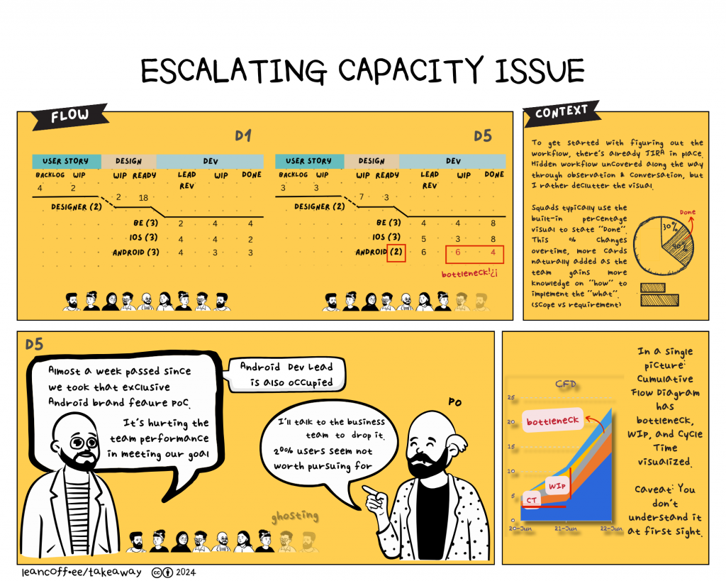
My core team was designer (analyst), backend, frontend IOS, and Android Devs. We were one of the squads catching the release train for one complex feature involving legacy payment messaging. Halfway through, one business stream planned to engage an Android brand, promising support to launch exclusive payment built-in their devices. The squad was selected to pull it on our load. With conviction (and out of luck) I had already established visualizing the flow a while ago. Since people gotten familiarized with it, I had no trouble in escalating what was visible as bottleneck that we suffered with.
All squads had already used Jira with an established workflow intact. So naturally they were using percentages generated out of the box. This might help on telling us how close we were to the goal,but that %-Done always change as Devs and PO learned more on “how” and “what” by adding more cards to Jira. Given so many cards, Jira became ticket system where member queried their individual tasks as table/list. Hence, there was no sense of flow nor capacity.
Eventually PMO contacted me asking whether we could use this visual flow for the rest of the squads in an effort to standardize. I said it still involved manual work, so better not for then. Personal conviction should go side by side with making more people buy-in to the idea of changing our way of working. I didn’t have enough champions.